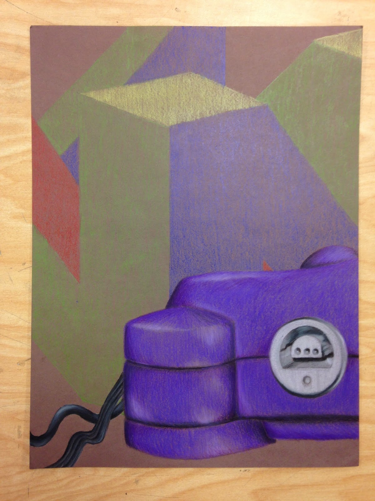
This piece was my for my Up-Close and Personal project, I think it was my most successful project. This drawing is of one fourth of a Nintendo-64, one of the most memorable things from my childhood. When I was thinking of ideas for my project, I focused more on the personal aspect of it. I thought about what were big things in my life, gaming was one of them. So I've found my object, but where to focus? For me one of the most prominent aspects of the N64 is the place where you plug in the controller, so I decided to focus a little on that area. I started by outlining the shape, then giving it some color. I enhanced my darks and lights and it was almost complete, except something was missing. A simple logo for the background pulled the whole piece together. The materials used, which are prismacolor colored pencils, makes all the difference. They have a good rich color which you can get amazing colors from. I think one of the things that really makes this one of my best is the placing. The actual console is off to the side and in the lower half. It makes good use of spacing.

This project was my mixed media project. It was my most unsuccessful project in my opinion. My theme for this project was Dungeons and Dragons (DND). I feel like I could have planned more to make it flow more, it just didn't flow too well. Also, the use of space wasn't as good as I hoped. I think it could have used more objects, and more materials, like watercolor or charcoal to make it more interesting.


The apple was one of the first pieces we did in art. It was really good practice with shading. Apples tend to have all kind of bumps and not smooth areas so the light hits them differently. The second picture is of a crumpled bag that we had done a couple days later. It gave me a challenge to recreate the different values of where the light was hitting the crumpled places. As you can see, even after a couple days of instruction there is a real difference. It helped us learn more about the different values that light can cause, even if the object is a solid color.


It's hard for me to choose my favorite medium. I usually choose my favorites by what I'm comfortable with, but in this case, that's not true. I'm extremely comfortable with pencil and colored pencil, they're easy for me to use and to control. But, I have to say that ink was my favorite medium. The India ink, free flowing ink. It gave a really deep and dark black color and it flowed really well. It was a lot of fun to use, and a bit harder to control, but it has to be my favorite medium.
No comments:
Post a Comment